



Introduction
In today’s fast-paced digital world, users expect apps and websites to respond instantly. A single delay — whether caused by network latency, data fetching, or complex rendering — can frustrate users and reduce engagement.
But here’s the twist: those unavoidable pauses don’t have to feel like wasted time. With the right UX loading screen design, delays can transform into moments of delight. A well-crafted loading state not only reassures users but also strengthens brand identity and improves retention.
Loading screens are no longer just placeholders — they’re powerful UX touchpoints that shape how users perceive your product.
The Engagement Gap: Understanding the Loading State
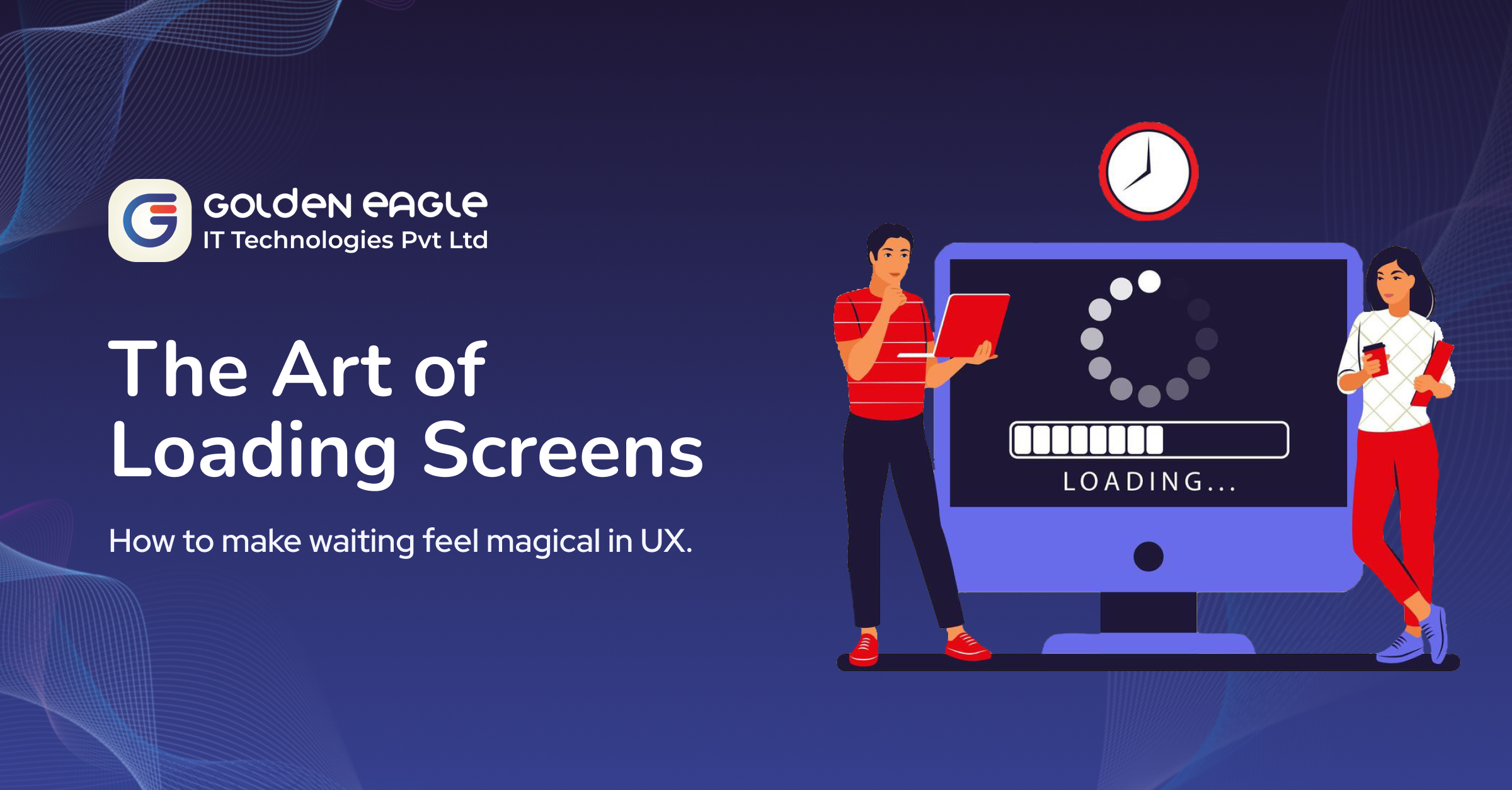
A loading screen is more than a spinning wheel. In UX, it’s a transitional state — the bridge between user intent (a click, scroll, or tap) and system response.
From a human-computer interaction perspective, a loading state serves three essential roles:
- Feedback: Reassures the user that the system is working.
- Engagement: Keeps users’ attention so the wait feels shorter.
- Brand Continuity: Extends your brand’s personality into micro-moments.
Why Loading Screens Matter in UX & User Retention
- Perceived Speed Matters More Than Actual Speed
Research shows users judge performance by responsiveness, not raw speed. A 3-second wait with engaging visuals can feel shorter than a dull 1-second pause. - Reducing Uncertainty
Unexplained delays frustrate users. A visible loading indicator reassures them that progress is happening. - Reinforcing Brand Identity
Every interaction is a branding opportunity. Copy, colour, and animations during load time reinforce personality and values. - Impact on Retention & Conversions
Google found that even a 1-second delay can reduce conversions. While loading screens can’t remove delays, they can hold user attention long enough to prevent drop-offs.
Best UX Strategies for Engaging Loading Screens
1. Skeleton Screens with Progressive Hydration
Instead of a blank screen, show a skeleton layout that gradually fills in with content. This gives users the illusion of speed.
Example: LinkedIn’s feed uses skeleton loaders that progressively update with actual posts.
Purposeful Motion Design
Animations should follow natural principles (easing, anticipation, smooth transitions). Subtle, fluid motion makes the wait feel seamless.
👉 Example: Netflix’s content rows slide in smoothly, creating a sense of continuity.
- Contextual & Branded Microcopy
Go beyond “Loading…” — use context-aware, playful, or brand-aligned text to add personality.
👉 Example: Slack shows quirky tips and fun messages while you wait.
- Set Clear Expectations with Progress Indicators
For tasks longer than 3–5 seconds, show progress bars, percentages, or status updates. If the wait is unpredictable, keep users engaged with micro-interactions.
👉 Example: Google Photos displays “We’re creating your memories…” to reassure users.
Gamification for Long Waits
For longer processes, add light interactivity — mini games, animated mascots, or cursor-responsive effects — to make waiting fun.
👉 Example: Duolingo’s owl reacts with fun animations during loading.
Common Pitfalls to Avoid
- Heavy Animations: Overdesigned visuals that increase loading time defeat the purpose.
- Endless Loops: Indicators without progress cause users to lose trust.
- Tone Mismatch: A playful animation in a serious enterprise app can hurt credibility.
FAQ: Loading Screens in UX
Q1: What is a loading screen in UX?
A loading screen is a transitional state shown while an app or website processes a user request, designed to provide feedback and maintain engagement.
Q2: Why are skeleton screens better than spinners?
Skeleton loaders mimic the final layout, making users feel content is appearing faster than with a static spinner.
Q3: How do loading animations affect user experience?
Engaging animations reduce perceived wait time, reinforce brand identity, and help maintain user trust.
Conclusion
Loading screens aren’t just technical necessities — they’re opportunities to delight, engage, and reassure users. With skeleton screens, meaningful animations, branded microcopy, and clear progress indicators, waiting becomes part of the experience rather than a frustration.
In a world where user attention is fleeting, these micro-moments can make the difference between churn and loyalty. Done right, loading screens turn delays into magical brand experiences.
By: Preyanshi Soni